Sidewalk AI
Industry
Architecture
Client
Sidewalk
Service
UX Design
Duration
1 Year
Real estate agents don't have a lead problem. They have a signal problem. The right clients are already in their contact list. The challenge is knowing which ones are ready to move, and reaching them before the window closes. Sidewalk AI was built to solve that.
The platform analyzed an agent's existing network and surfaced the contacts most likely to buy, sell, or refinance, using proprietary predictive modeling that reverse-engineered the behavioral and financial signals behind real estate decisions. My job was to make that intelligence legible, actionable, and fast.
The Challenge
A proprietary intelligence engine with no design language to carry it.
When I joined the team, Sidewalk had a working data model and no product. The predictive system could identify high-probability clients with meaningful accuracy. But there was no interface, no design system, no cross-platform consistency, and no established pattern for how to surface AI-generated recommendations to a non-technical user operating under real time pressure.
Real estate agents are not analysts. They're in the car, between showings, making decisions in seconds. The design challenge wasn't organizing data. It was translating a complex proprietary system into something a busy agent could act on without thinking hard about it.
My Role
Design lead. Zero to one. Cross-platform.
I led the complete design effort as the senior designer on a three-person team, working directly with product, engineering, and stakeholders across the full product lifecycle. There was no system to inherit. Every decision was built from first principles: information architecture, component structure, interaction patterns, cross-platform behavior, and visual language.
This also meant making the case for every structural decision, not just executing on briefs. Navigation model, alert architecture, signal taxonomy, breakpoint behavior: all had to be reasoned and defended before a pixel moved
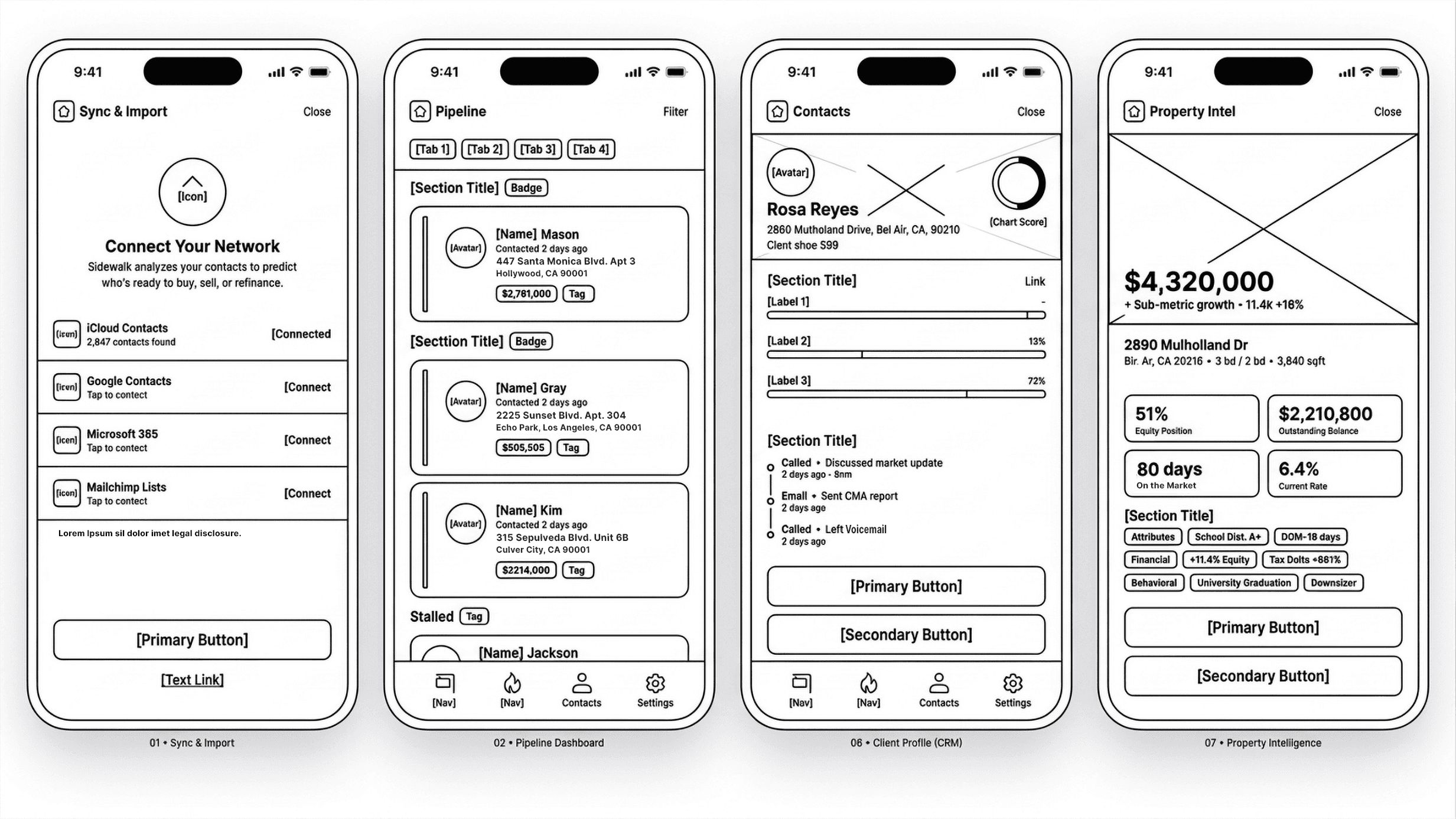
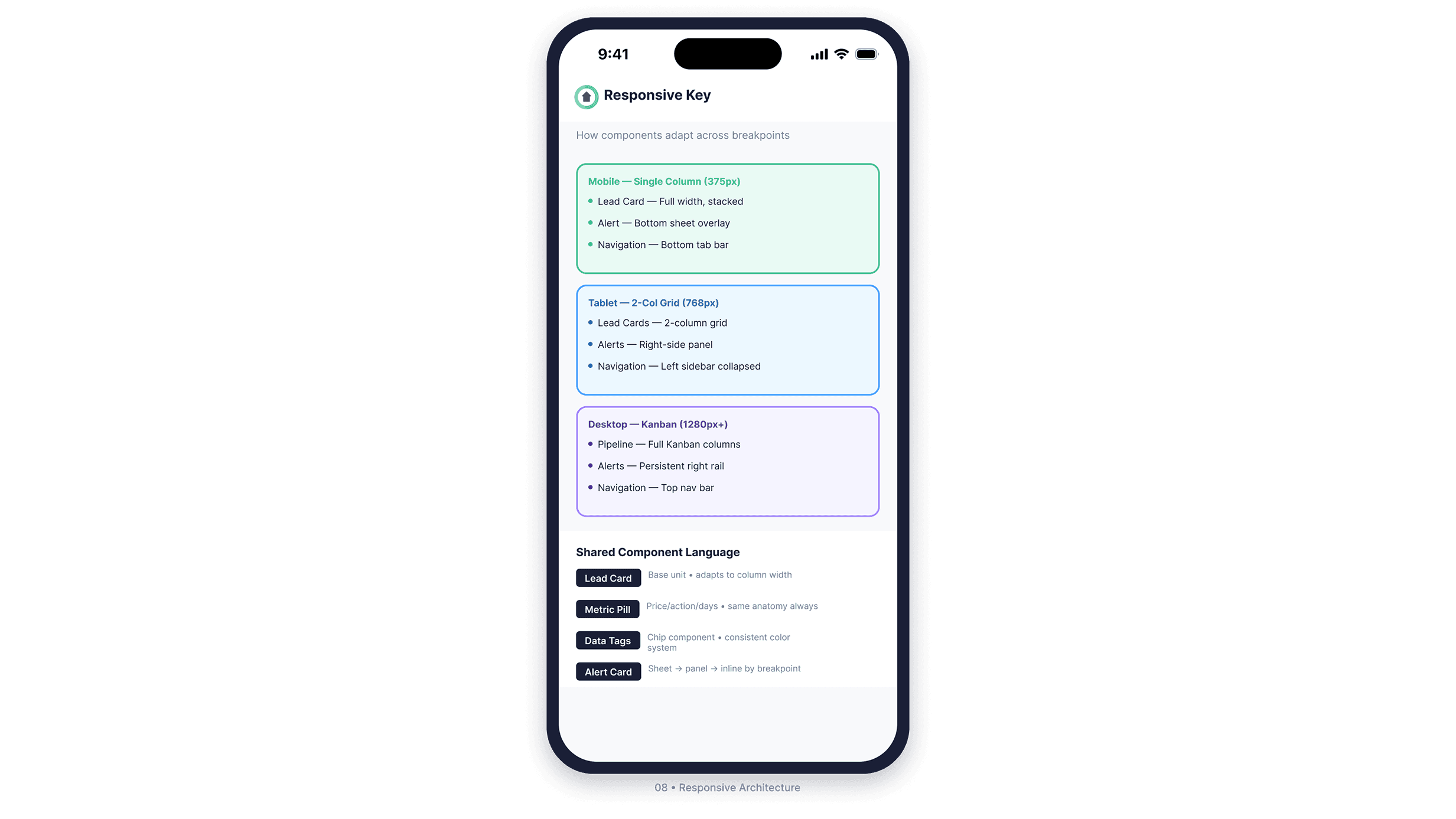
Structure Before Aesthetics
Four components. Every breakpoint. One shared language.
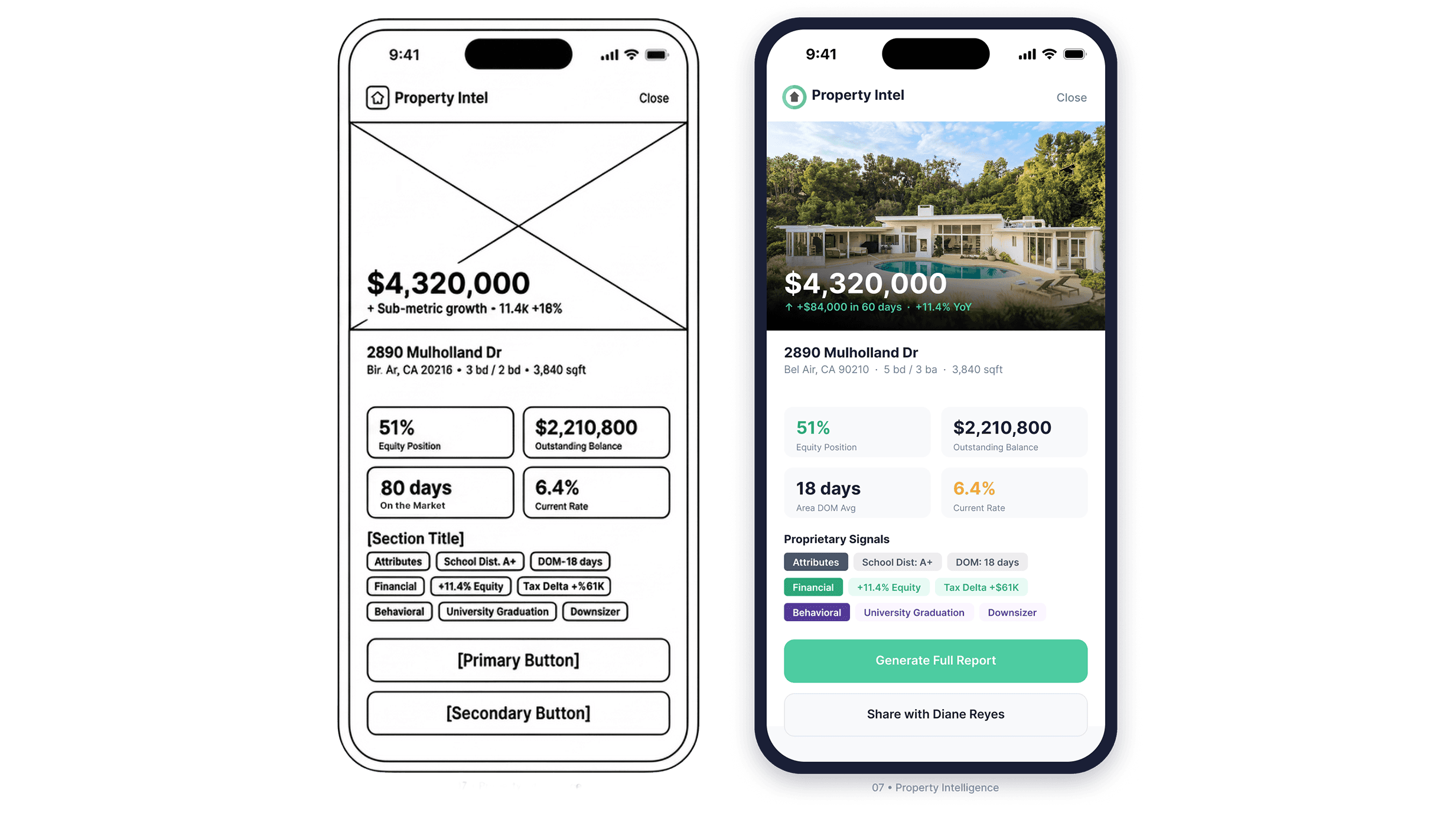
The wireframes came first. Before color, before photography, before any visual decisions were made, the architecture was locked: component hierarchy, button priority, navigation model, and signal taxonomy. The four screens above are from that early structure pass. The final product is a direct translation of what you see there, not a departure from it.
I identified four component types that would need to travel across every breakpoint: the Lead Card, the Metric Pill, Data Tags, and the Alert Card. Getting those right meant the rest of the system had something to build on.
The Lead Card became the base unit of the entire product. On mobile it stacks full width. On tablet it fits a two-column grid. On desktop it populates a full Kanban pipeline. Same anatomy, same hierarchy, same information: adapted rather than redesigned at every breakpoint.
The Alert Card went through the most iteration. On mobile it surfaces as a bottom sheet overlay. On tablet it becomes a right-side panel. On desktop it lives in a persistent right rail. The component had to interrupt without trapping, inform without overwhelming, and resolve in two taps regardless of where it appeared.
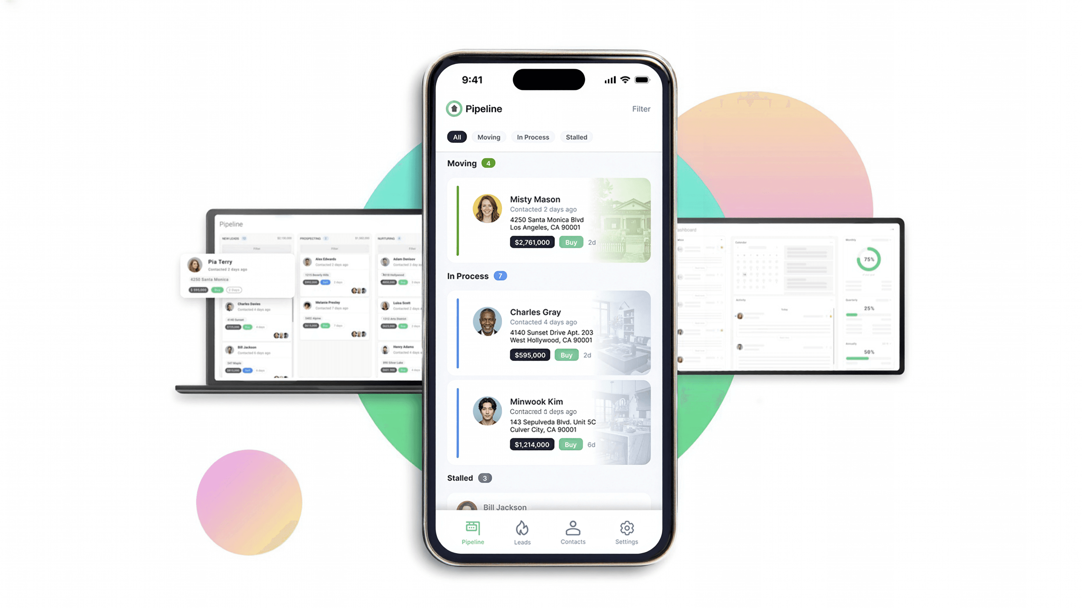
Onboarding and Pipeline
Start with trust. Work from there.
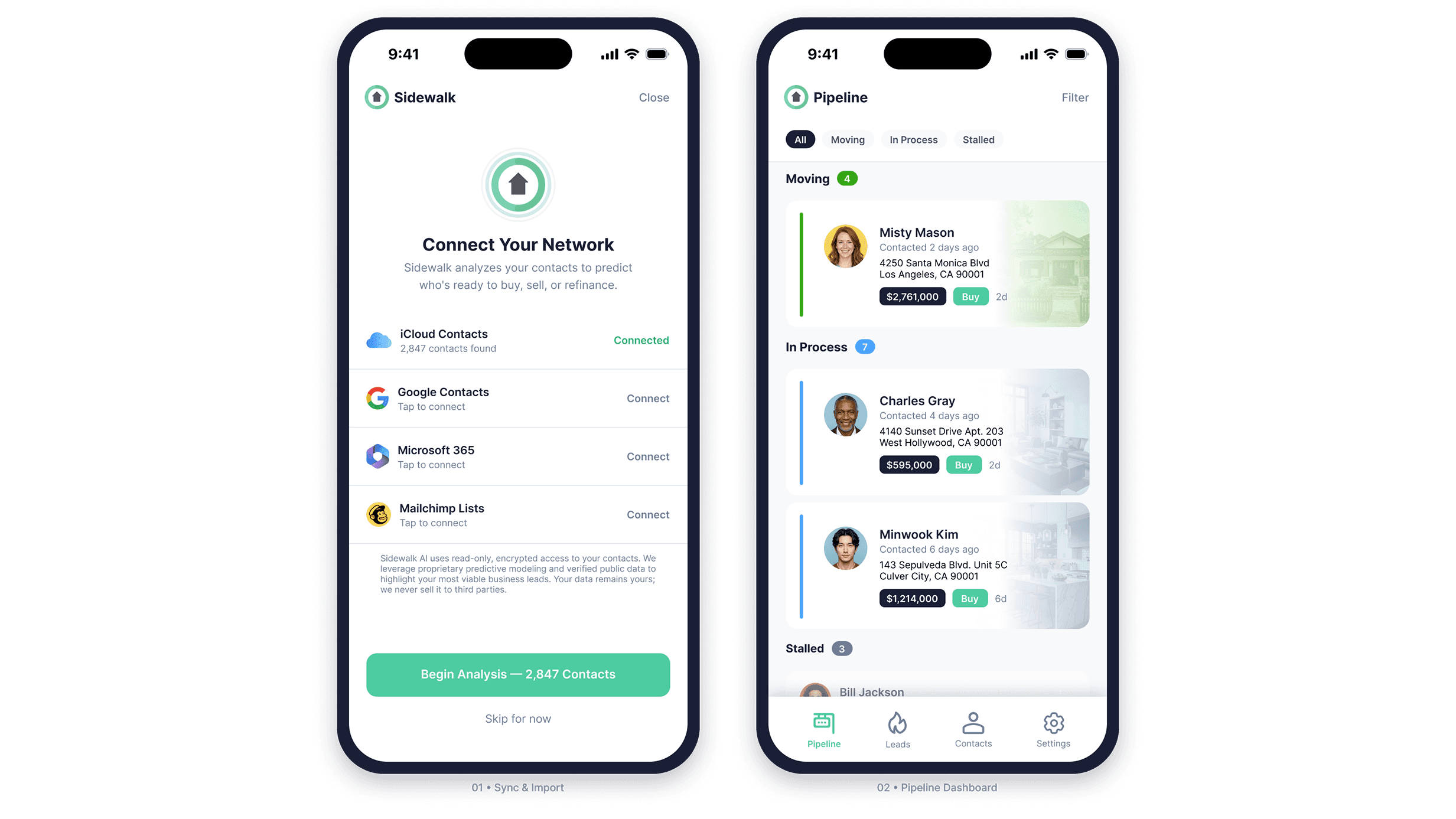
The sync screen is the product's first real ask: access to a contact list. That is a permission request with real privacy implications, and getting it wrong at onboarding ends the relationship before the product has a chance to prove itself. The design leads with transparency. Source options are clearly presented, connection status is explicit, and the trust copy at the bottom directly addresses what a cautious user is already thinking.
The pipeline view was designed as a working surface, not a status readout. Deals are grouped by momentum stage. Each card carries enough context for the agent to act without drilling in. The color rail system communicates stage semantically: green for active momentum, blue for in-progress, gray for stalled. On desktop this expands into a full Kanban. On mobile it collapses into a grouped list. The card anatomy is identical at every breakpoint.
Intelligence and Alerts
Surface the signal. Compress the decision.
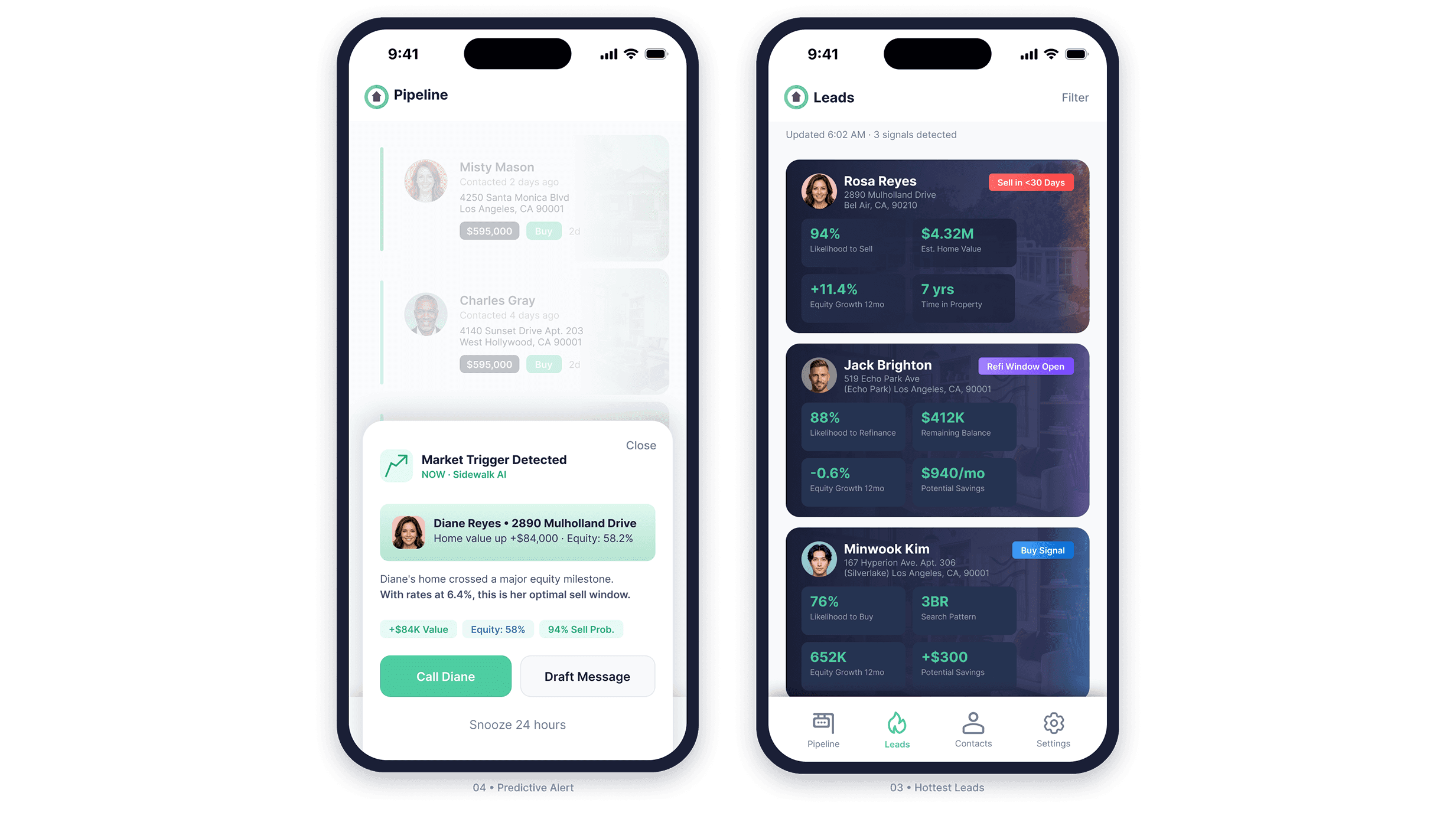
The Leads view is the product's primary intelligence layer. Every contact surfaces with a signal badge categorizing the opportunity type and a 2x2 metric grid carrying the numbers the agent needs to start a conversation. The contact's property appears as a card background. Real estate is emotional. Keeping the home visible keeps the agent anchored to what the conversation is actually about.
When a market trigger crosses a threshold, the system fires a contextual alert as a bottom sheet over whatever the agent is currently doing. The alert is dismissible and snoozable. It interrupts without trapping. Every alert follows the same anatomy: trigger reason, client context, a plain-language explanation of why this matters
right now, supporting data chips, and a clear action pair. Call or draft a message in two taps.
Reactive Intelligence and CRM
When a client reaches out, the system already knows.
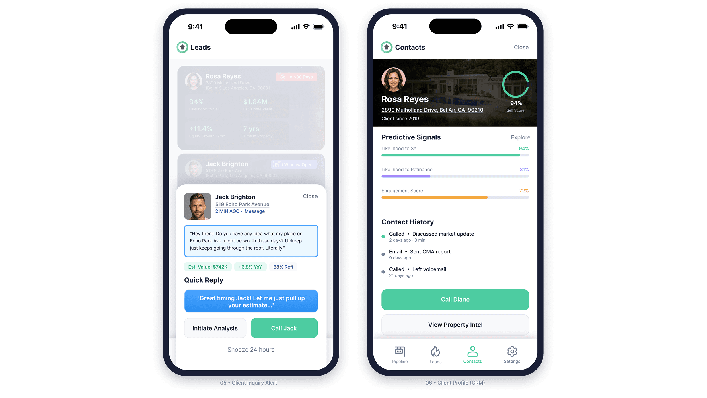
When a client contacts the agent directly, Sidewalk recognizes the contact, pulls property data, and surfaces it alongside the message in real time. The agent doesn't switch apps or look anything up. The Quick Reply pattern keeps the conversation moving digitally. Call Jack escalates to a live conversation. The distinction is built into the visual hierarchy: one action continues the thread, the other changes the channel.
The contact profile consolidates predictive signal bars, contact history, and direct action into a single view. Three signal types use distinct colors so the agent reads the composite picture at a glance rather than parsing individual numbers: likelihood to sell, likelihood to refinance, and engagement score. Contact history is deliberately sparse. Channel, topic, recency. Enough context for the next call. Nothing that buries
the signals that drove the agent here.
Property Intelligence
Three signal types. One taxonomy.
The property detail view organizes proprietary signals into three distinct categories: property attributes, financial indicators, and behavioral inferences. Each carries a different visual treatment. A school district rating and a life event trigger are fundamentally different kinds of data. Treating them identically would flatten the reasoning behind the recommendation. The taxonomy makes the system's logic visible to someone who has no idea how it works under the hood.
Outcome
A zero-to-one product built to scale.
Sidewalk AI launched as a fully realized cross-platform product across mobile, tablet,
and desktop. The design system established during the engagement gave engineering a
consistent implementation target and reduced the surface area for inconsistency as
the product grew. The predictive intelligence layer, from signal taxonomy to alert
architecture, was designed to make the system's reasoning legible to non-technical
users operating under time pressure.
The product has since been acquired and continues under a new name. The work stands.
Reflection
Complexity isn't the enemy. Opacity is.
The hardest design problem on Sidewalk wasn't any individual screen. It was the gap between what the system knew and what the agent could actually use. A predictive model that surfaces the right client at the right moment is only valuable if the person receiving that signal can act on it in under ten seconds.
Every decision on this product, from the alert architecture to the signal taxonomy to the component system to the breakpoint logic, was made in service of that constraint. When you remove the friction between an insight and an action, you don't just improve a metric. You change what the tool is capable of.
That's the work worth doing.