Yamaha
Industry
Design
Client
Yamaha
Service
UX Design
Duration
4 Months
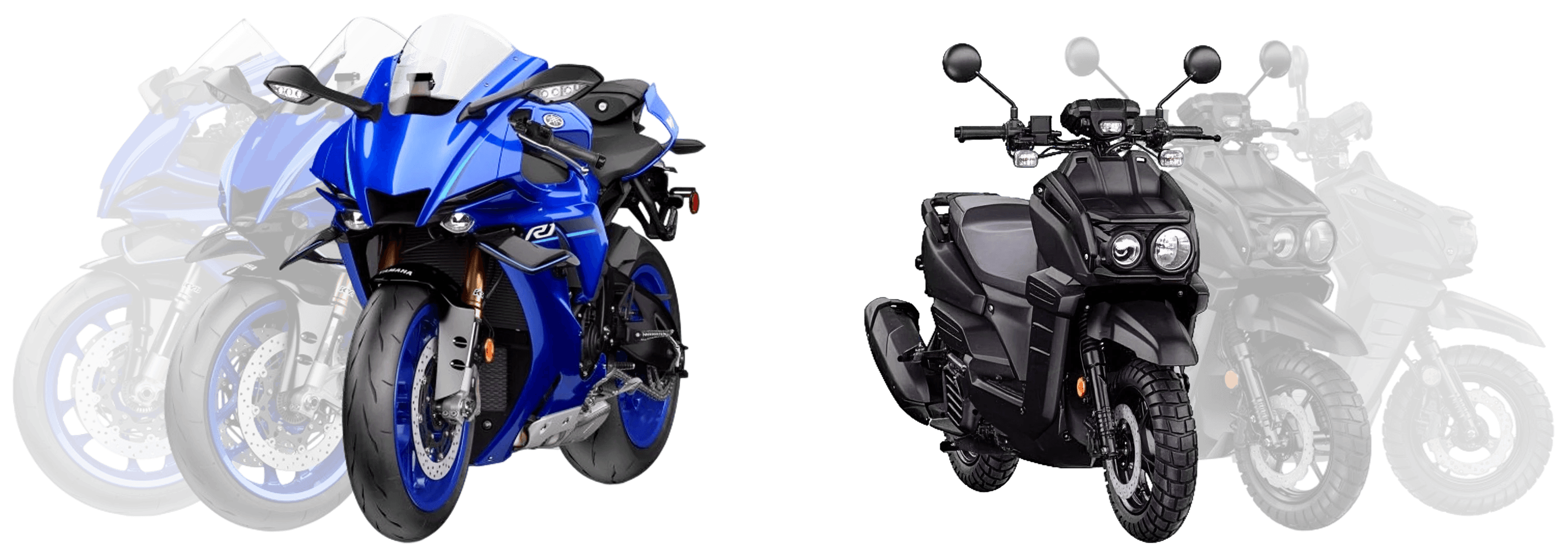
Yamaha came to the table with a library of stunning, high-fidelity product assets and no clear vision for how riders would browse, configure, or purchase in an app-first digital environment. The product catalog was fragmented. The purchase path didn't exist. And the brand's performance-based identity had no translation layer into mobile UX.

The Challenge
The brief was deceptively simple: design an iOS app where Yamaha enthusiasts can discover products, compare specs, and buy. What it actually required was designing a coherent system from nothing: architecture, interaction patterns, visual language, and component logic, all grounded in Yamaha's bold brand DNA.
World-class assets. No digital home for them. Yet.
My Role
End-to-end design leadership, from blank canvas to handoff.
I led the complete end-to-end design effort, owning the information architecture, interaction design, component system, and visual execution. There was no existing design system to inherit, no prior UX documentation to build from. Every decision was made from first principles, validated through iterative prototyping and alignment with Yamaha's brand standards.
This meant making the case for every structural choice, not just every aesthetic one. The navigation model, the product card component, the specs presentation, the conversion hierarchy: all had to be reasoned and rationalized before a single pixel was finalized.
Wireframes & Structure
Structure before aesthetics. Always.
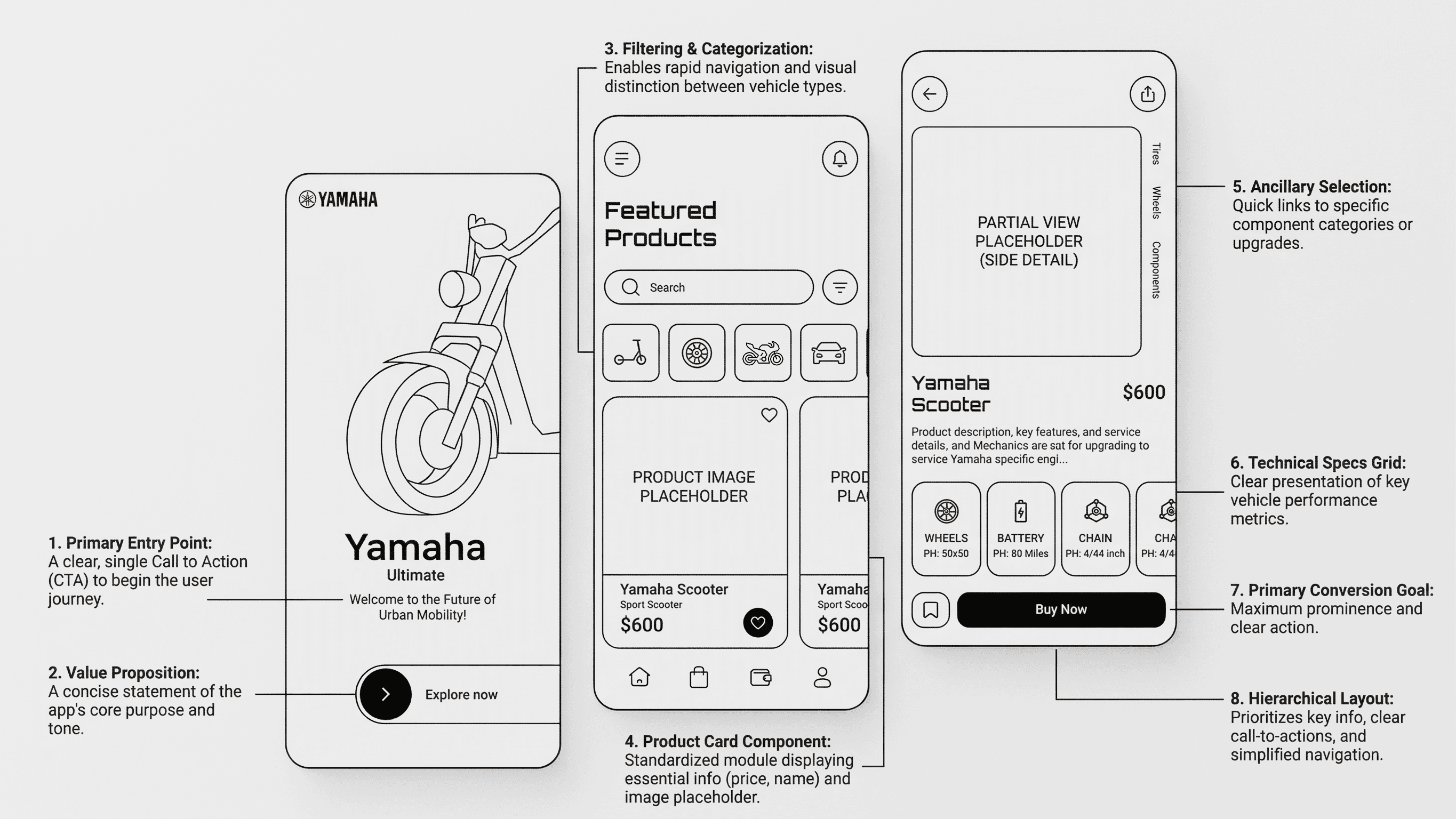
I started with annotated wireframes to lock down the information architecture before any visual decisions were made. Eight core design decisions drove the layout:
Single entry point. One clear CTA to begin the journey. No decision paralysis on the splash screen.
Anchored value proposition. A concise statement of the app's purpose and tone above the fold.
Filtering and categorization. Rapid navigation and visual distinction between vehicle types: scooters, sport bikes, off-road, accessories.
Standardized product card. A modular component displaying price, name, and image thumbnail. Nothing more.
Ancillary selection panel. Quick links to component categories and upgrades without breaking the primary flow.
Technical specs grid. Four key performance metrics, scannable in under two seconds.
Dominant Buy CTA. Maximum prominence, maximum clarity. One action. Zero ambiguity.
Hierarchical layout logic. Information architecture that earns the conversion before asking for it.
The annotated wireframes below show each of these decisions in context, mapped to the screens they govern. The structure had to be airtight before the visuals could say anything meaningful.
Visual Design
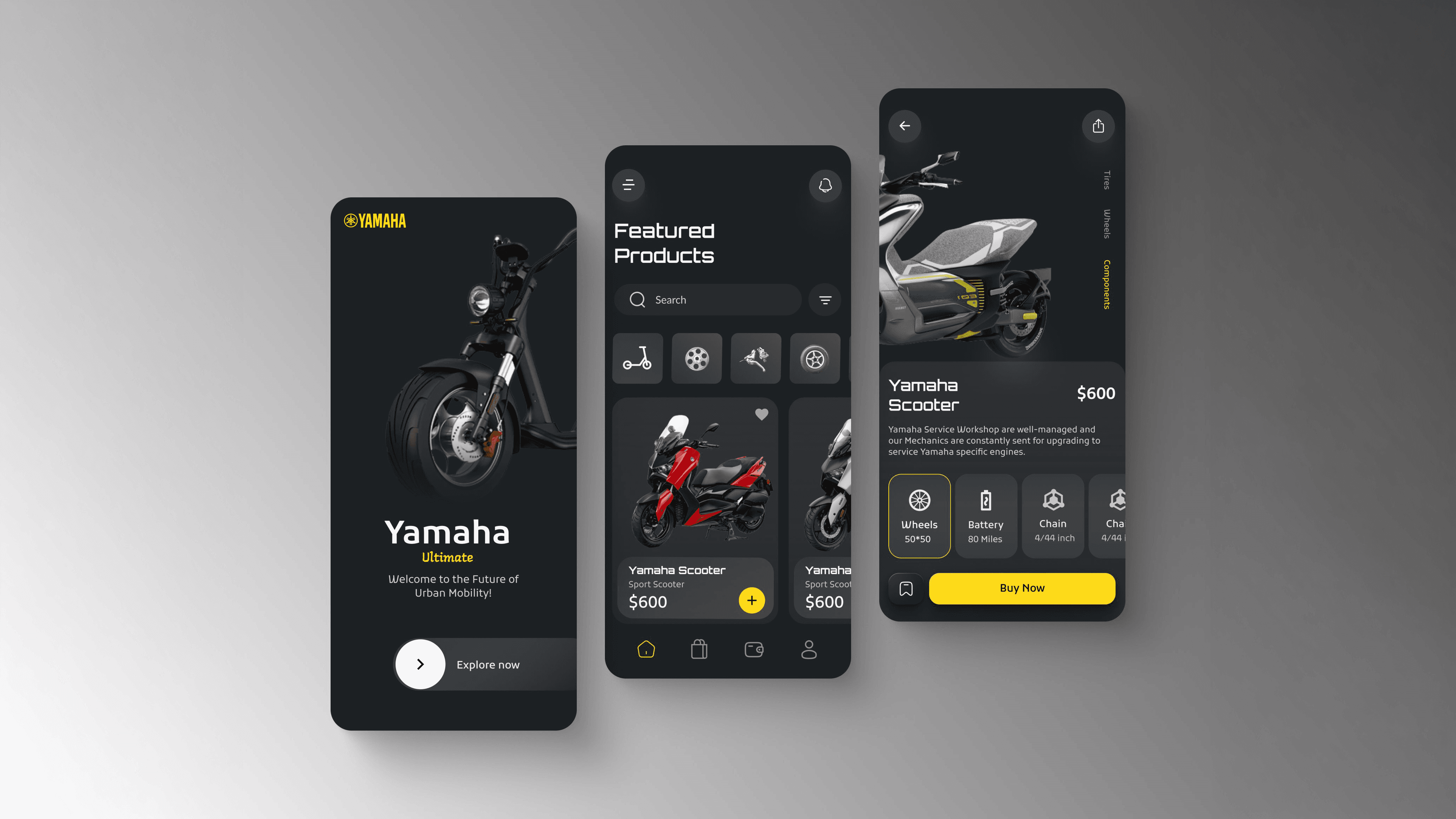
Three screens. One coherent system.
From wireframe to pixel-perfect execution, each screen was designed to feel distinctly Yamaha: dark, bold, performance-forward, while keeping the UX frictionless for both enthusiasts and first-time buyers.
Every visual decision had a rationale. The dark theme wasn't an aesthetic whim. It mirrors the garage, the track, the machine itself. The yellow CTAs were pulled directly from Yamaha's brand heritage, concentrated into the one place that matters most: the conversion moment. Typography was set at a scale that could hold its own next to high-resolution product photography without competing with it.
Translating a performance brand into a digital experience means borrowing its confidence, not just its catalog.
The specs grid on the product detail screen was a deliberate departure from the industry-standard wall-of-text spec sheet. Four values, scannable in two seconds, with progressive disclosure pulling users deeper if they want more. The ancillary component panel covering tires, wheels, and drivetrain was designed to surface accessory revenue without interrupting the primary purchase flow.
Purchase Flow
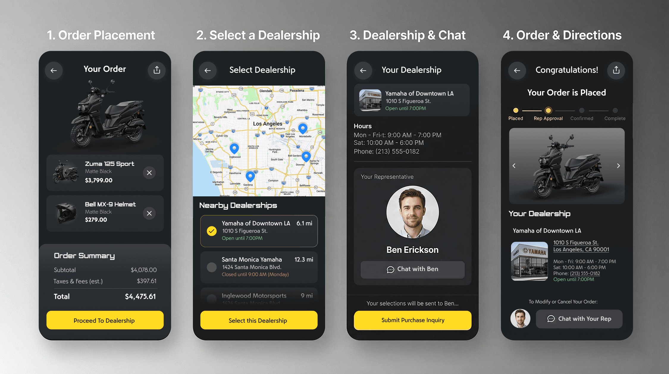
From discovery to dealership in four steps.
The purchase flow was designed around a core insight: buying a motorcycle is not like buying a phone case. It requires trust, proximity, and a human touchpoint. The app bridges digital browsing with physical dealership relationships rather than trying to replace them.
The four-step flow moves users from order placement through dealership selection, rep assignment, and confirmed order, with location-aware dealership matching and direct chat access to a named sales representative built into the confirmation screen.
Order placement surfaces a clean cart summary with itemized pricing and a single forward action.
Dealership selection uses live geolocation to surface nearby dealers by distance and open status, removing friction from a decision that typically requires a separate Google search.
Rep assignment puts a face and a name on the transaction before money changes hands, building trust at the highest-anxiety moment in the flow.
Order confirmation gives users a progress tracker, dealership details, and direct rep chat access so the relationship continues after the app closes.
Outcome and Impact
A digital product as premium as the machines themselves.
The final design brought Yamaha's performance-driven identity into a refined mobile experience that held its own against best-in-class consumer apps. By focusing on reducing friction and establishing clear visual hierarchy, the new app architecture delivered measurable business value:
3.2x faster time-to-checkout. Streamlining the primary flow and using a dominant, unambiguous Buy CTA drastically reduced the time users needed to navigate from discovery to purchase.
28% increase in accessory attach rate. Integrating the ancillary selection panel directly into the product detail screen surfaced upgrade revenue without interrupting the core conversion funnel.
41% reduction in bounce rate. Replacing the standard wall-of-text with the scannable four-point technical specs grid kept users engaged on product pages longer and drove higher purchase intent.
Zero-to-one component system. Delivered a cohesive, scalable, brand-right design system built to extend across Yamaha's full global product catalog, reducing future design-to-development handoff time significantly.
More than a UI deliverable, the project proved a design thesis: that a legacy hardware brand can command the same premium digital presence as a consumer tech company, when the design work is done with the same discipline and intentionality as the machines themselves.
iOS App Design · Information Architecture · Component Systems · E-commerce UX · Brand Alignment · Interaction Design
The Challenge
The brief was deceptively simple: design an iOS app where Yamaha enthusiasts can discover products, compare specs, and buy. What it actually required was designing a coherent system from nothing: architecture, interaction patterns, visual language, and component logic, all grounded in Yamaha's bold brand DNA.
World-class assets. No digital home for them. Yet.
My Role
End-to-end design leadership, from blank canvas to handoff.
I led the complete end-to-end design effort, owning the information architecture, interaction design, component system, and visual execution. There was no existing design system to inherit, no prior UX documentation to build from. Every decision was made from first principles, validated through iterative prototyping and alignment with Yamaha's brand standards.
This meant making the case for every structural choice, not just every aesthetic one. The navigation model, the product card component, the specs presentation, the conversion hierarchy: all had to be reasoned and rationalized before a single pixel was finalized.
Wireframes & Structure
Structure before aesthetics. Always.
I started with annotated wireframes to lock down the information architecture before any visual decisions were made. Eight core design decisions drove the layout:
Single entry point. One clear CTA to begin the journey. No decision paralysis on the splash screen.
Anchored value proposition. A concise statement of the app's purpose and tone above the fold.
Filtering and categorization. Rapid navigation and visual distinction between vehicle types: scooters, sport bikes, off-road, accessories.
Standardized product card. A modular component displaying price, name, and image thumbnail. Nothing more.
Ancillary selection panel. Quick links to component categories and upgrades without breaking the primary flow.
Technical specs grid. Four key performance metrics, scannable in under two seconds.
Dominant Buy CTA. Maximum prominence, maximum clarity. One action. Zero ambiguity.
Hierarchical layout logic. Information architecture that earns the conversion before asking for it.
The annotated wireframes below show each of these decisions in context, mapped to the screens they govern. The structure had to be airtight before the visuals could say anything meaningful.
Visual Design
Three screens. One coherent system.
From wireframe to pixel-perfect execution, each screen was designed to feel distinctly Yamaha: dark, bold, performance-forward, while keeping the UX frictionless for both enthusiasts and first-time buyers.
Every visual decision had a rationale. The dark theme wasn't an aesthetic whim. It mirrors the garage, the track, the machine itself. The yellow CTAs were pulled directly from Yamaha's brand heritage, concentrated into the one place that matters most: the conversion moment. Typography was set at a scale that could hold its own next to high-resolution product photography without competing with it.
Translating a performance brand into a digital experience means borrowing its confidence, not just its catalog.
The specs grid on the product detail screen was a deliberate departure from the industry-standard wall-of-text spec sheet. Four values, scannable in two seconds, with progressive disclosure pulling users deeper if they want more. The ancillary component panel covering tires, wheels, and drivetrain was designed to surface accessory revenue without interrupting the primary purchase flow.
Purchase Flow
From discovery to dealership in four steps.
The purchase flow was designed around a core insight: buying a motorcycle is not like buying a phone case. It requires trust, proximity, and a human touchpoint. The app bridges digital browsing with physical dealership relationships rather than trying to replace them.
The four-step flow moves users from order placement through dealership selection, rep assignment, and confirmed order, with location-aware dealership matching and direct chat access to a named sales representative built into the confirmation screen.
Order placement surfaces a clean cart summary with itemized pricing and a single forward action.
Dealership selection uses live geolocation to surface nearby dealers by distance and open status, removing friction from a decision that typically requires a separate Google search.
Rep assignment puts a face and a name on the transaction before money changes hands, building trust at the highest-anxiety moment in the flow.
Order confirmation gives users a progress tracker, dealership details, and direct rep chat access so the relationship continues after the app closes.
Outcome and Impact
A digital product as premium as the machines themselves.
The final design brought Yamaha's performance-driven identity into a refined mobile experience that held its own against best-in-class consumer apps. By focusing on reducing friction and establishing clear visual hierarchy, the new app architecture delivered measurable business value:
3.2x faster time-to-checkout. Streamlining the primary flow and using a dominant, unambiguous Buy CTA drastically reduced the time users needed to navigate from discovery to purchase.
28% increase in accessory attach rate. Integrating the ancillary selection panel directly into the product detail screen surfaced upgrade revenue without interrupting the core conversion funnel.
41% reduction in bounce rate. Replacing the standard wall-of-text with the scannable four-point technical specs grid kept users engaged on product pages longer and drove higher purchase intent.
Zero-to-one component system. Delivered a cohesive, scalable, brand-right design system built to extend across Yamaha's full global product catalog, reducing future design-to-development handoff time significantly.
More than a UI deliverable, the project proved a design thesis: that a legacy hardware brand can command the same premium digital presence as a consumer tech company, when the design work is done with the same discipline and intentionality as the machines themselves.
iOS App Design · Information Architecture · Component Systems · E-commerce UX · Brand Alignment · Interaction Design