US Bank
Industry
Financial Services
Client
US Bancorp (US Bank)
Service
UX Design
Duration
2 Years
Managing money is never just a functional act. It's deeply emotional. U.S. Bank operates in one of the most regulated, high-stakes digital environments imaginable, where every screen carries both legal weight and personal significance.

When I joined the team, the digital investing experience was fragmented. Users were dropped into complex financial concepts with no guidance, asked to make high-stakes decisions with minimal context, and abandoned at the moments that mattered most: onboarding, risk selection, and product decisions. The data confirmed what qualitative research had already surfaced. Users didn't lack intent. They lacked clarity.
The problem wasn't any single screen. It was the entire system.
Project 1: Automated Investor Journey
Small effort. Big results. Approachable for everyone.
The Automated Investor platform was U.S. Bancorp Investments' robo-advisory product, built to help everyday customers start investing toward personal goals. In theory, a powerful offering. In practice, a maze of an experience that intimidated the very people it was designed to serve.
The problem
The existing onboarding flow asked users to interpret financial jargon, complete disconnected steps, and accept regulatory disclosures without ever understanding why they mattered. Drop-off rates spiked at every friction point. The experience felt like a compliance checklist dressed up as a product.
My approach
I approached this as a systems design challenge, starting from how real people think about money rather than how financial products are legally structured. Through user research, journey mapping, and iterative prototyping, one insight kept surfacing: users needed a guided, conversational experience. Not a series of forms.
The redesign centered on three principles:
Progressive Disclosure. Surface only what users need to make the next decision. Financial complexity should unfold naturally, not hit all at once.
Goal-First Architecture. Begin with what users actually want: a house, retirement, a child's education. Anchor every step to something emotionally meaningful before introducing the mechanics of how to get there.
Compliance as Clarity. Regulatory requirements aren't obstacles to bury or footnote. They're opportunities to build trust. I redesigned every disclosure touchpoint to feel transparent and human, rather than legal and opaque.
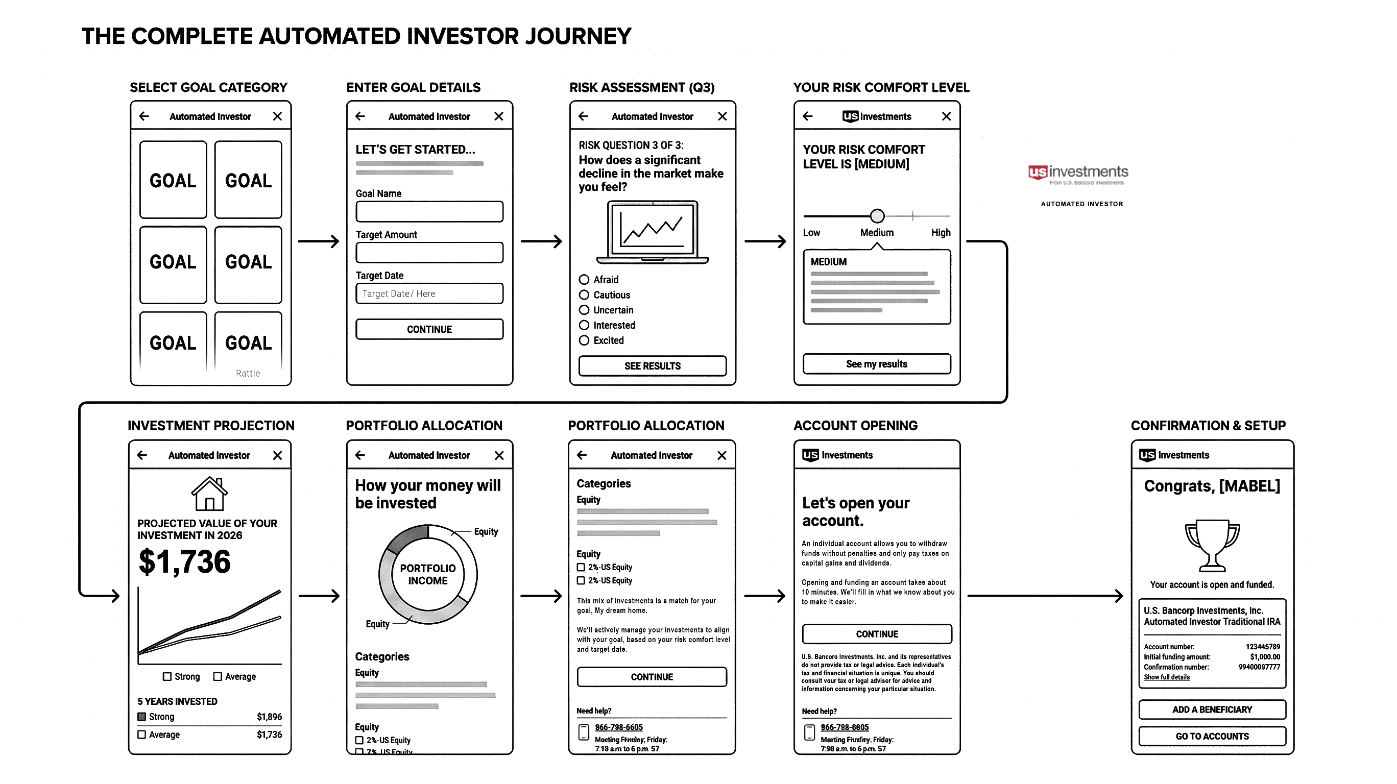
The wireframe below shows the full end-to-end system before visual design. Notice how the flow moves from emotional goal-setting into financial mechanics, never the reverse. That sequencing was the core design argument.
The experience
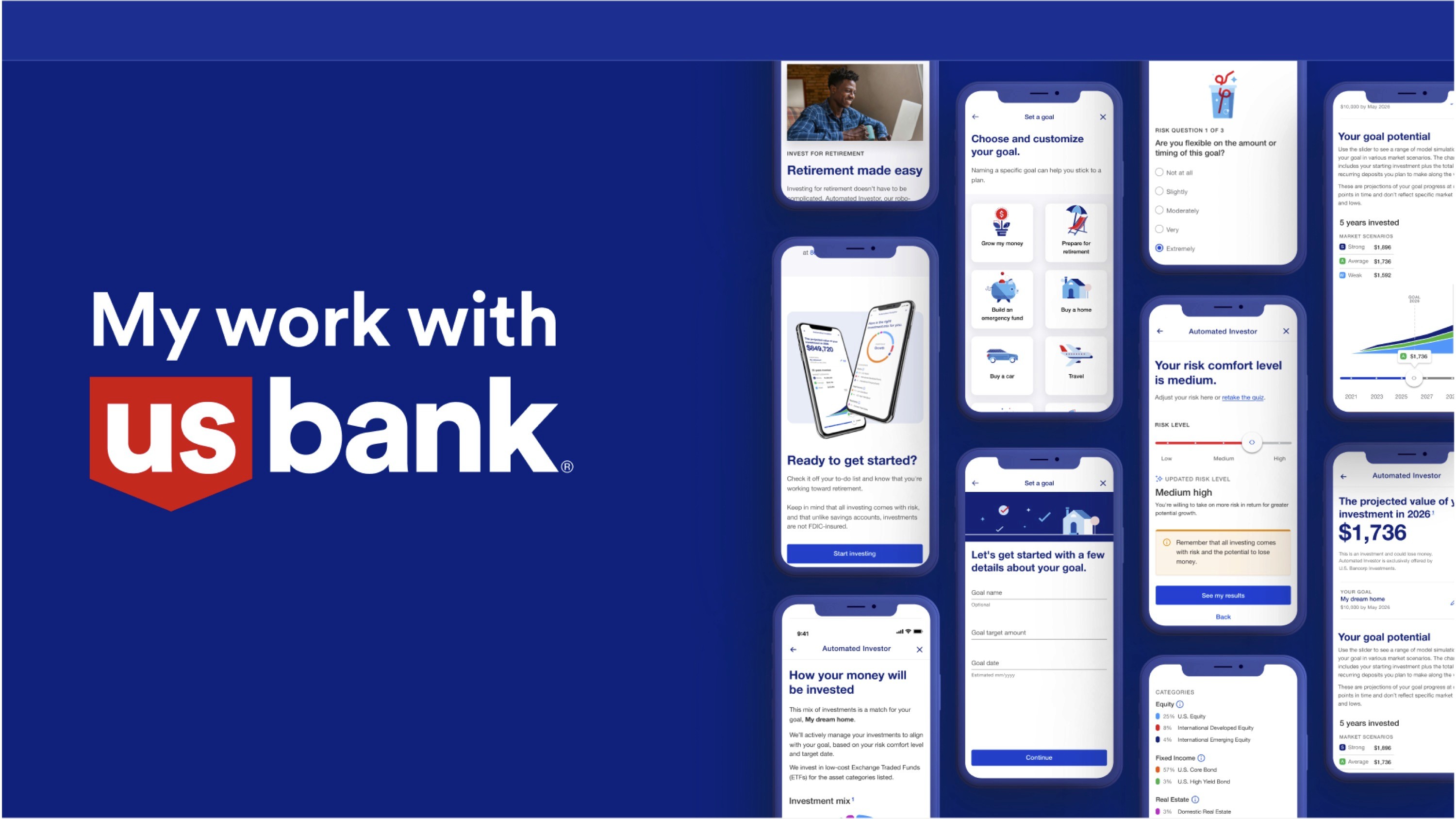
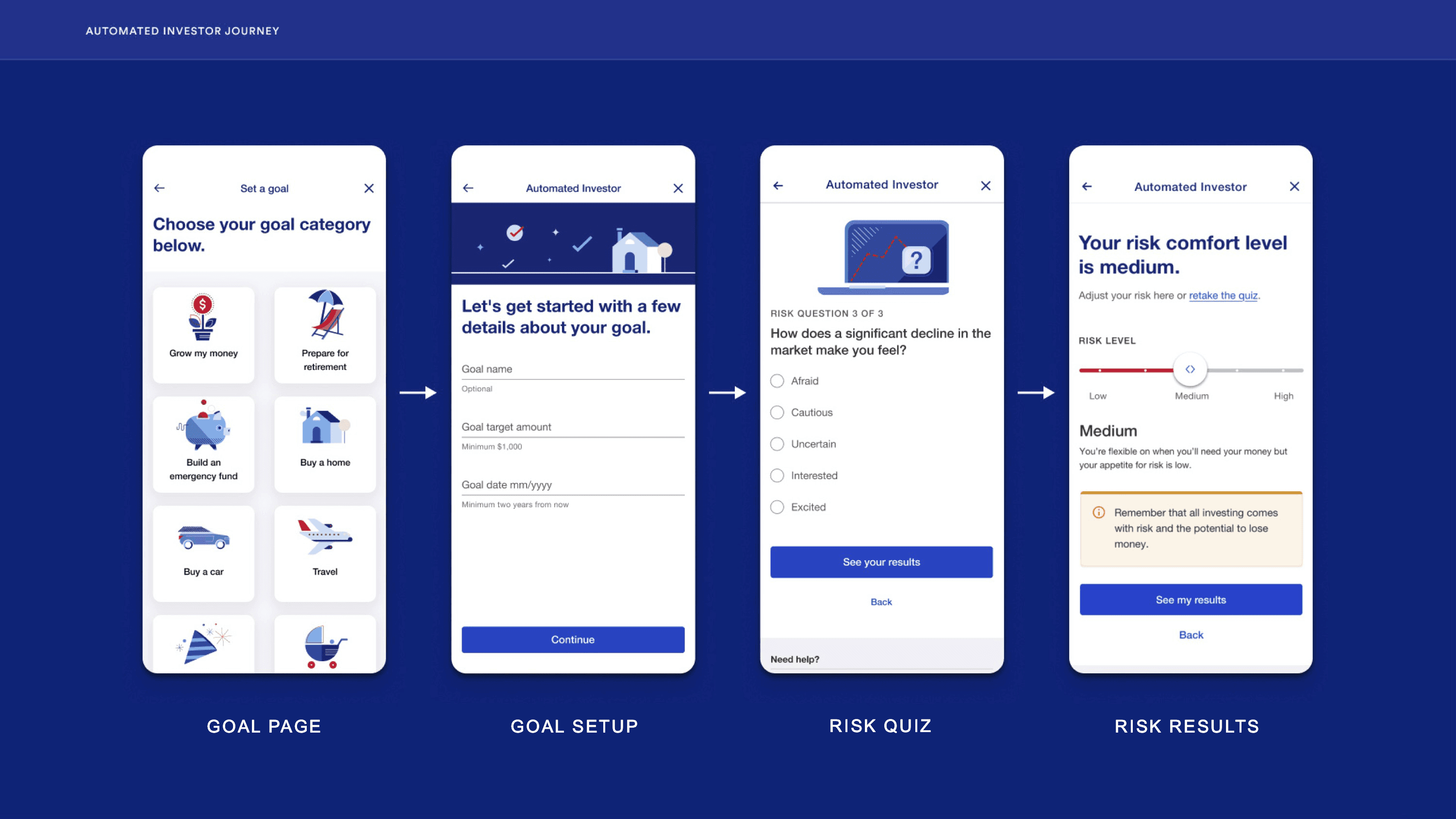
The journey starts with an Insight Card that surfaces relevant financial context inside the user's existing account view, drawing them naturally into the goal-setting flow without a hard redirect. From there, a Goal Page sets the emotional anchor. Goal Setup personalizes the experience: target amount, timeline, flexibility. The Risk Quiz uses plain language and empathetic framing to uncover comfort level without intimidating first-time investors.
The screens below show the first half of the journey, from goal selection through risk assessment. Each step is designed to feel like a decision the user is making for themselves, not a form they're filling out for a bank.
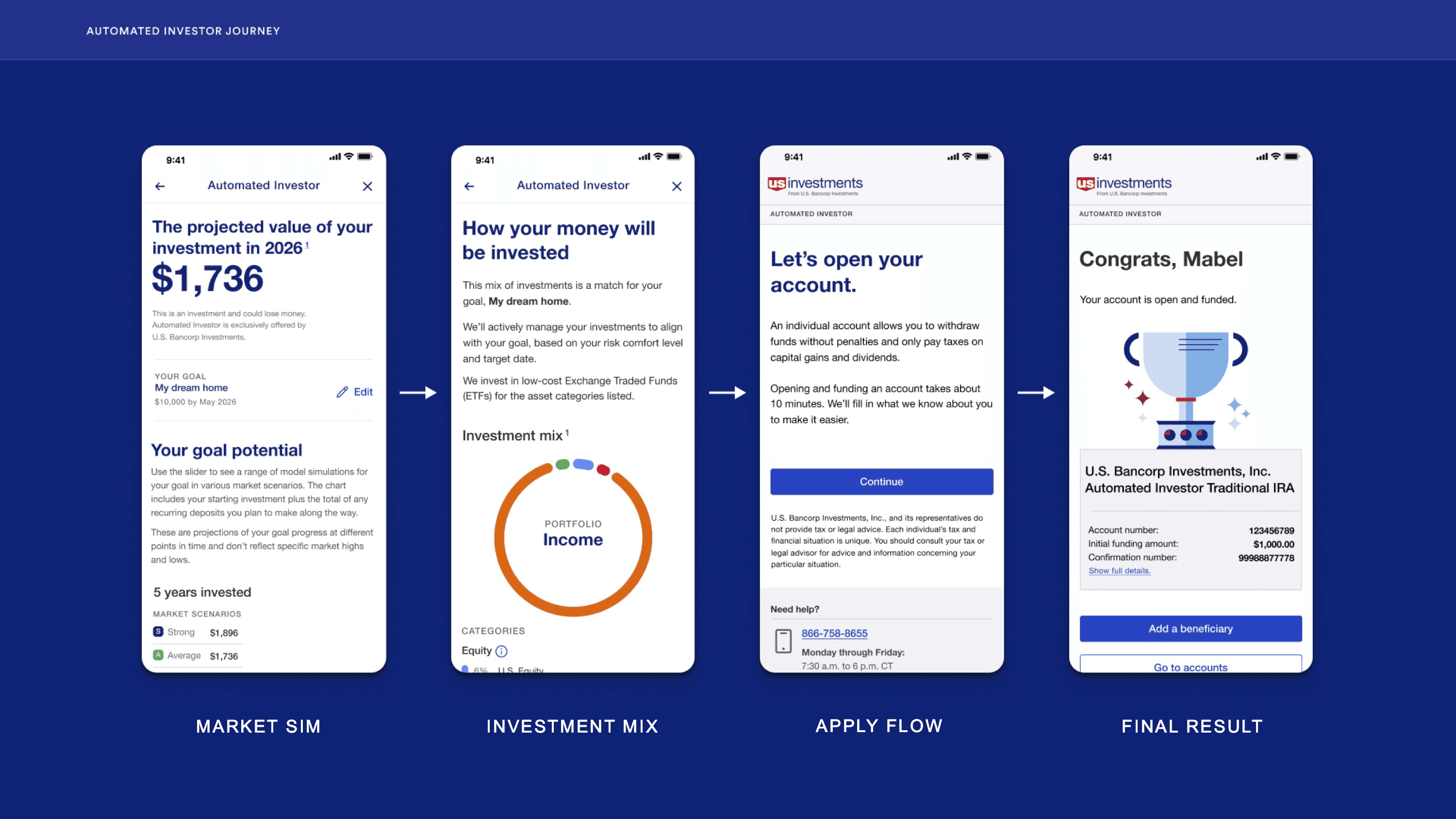
From Risk Results, a Market Simulation makes projected growth tangible and interactive. Users can move a slider to see how different contributions affect their outcome over time. The Investment Mix screen shows exactly how their money will be deployed. The Apply Flow opens an Individual Advisory Account in under ten minutes.
This is the back half of the journey, where abstract risk tolerance becomes a concrete portfolio and intention becomes action.
Every step was built to reduce cognitive load, build confidence, and get out of the way.
Project 2: Shop & Browse
Answering the needs of the emergent affluent crowd.
The second initiative tackled U.S. Bank's product discovery experience: the surface where customers explore credit cards, investment products, and financial tools. The challenge here was different, but equally nuanced.

The Audience
Through UX research and data analysis, we identified a fast-growing segment within U.S. Bank's customer base: the emergent affluent. These are digitally-native professionals with rising income, lifestyle-driven priorities, and expectations shaped by premium consumer apps, not traditional banking.
These users valued personalization, immediacy, and experiences that felt curated for them. U.S. Bank's existing Shop & Browse was a one-size-fits-all catalog. It didn't speak to anyone in particular.
My approach
I led the redesign with the emergent affluent as the north star, while ensuring the experience scaled gracefully across all customer segments.
The work involved deep competitive analysis, audience segmentation, and close collaboration with product strategy and engineering to define what a premium financial shopping experience could look like inside U.S. Bank's design system and regulatory framework.
Key design decisions included:
Lifestyle-aligned visual hierarchy. Product features presented through the lens of aspiration and real-world use, not feature lists.
Contextual product surfacing. Relevant products appear at the right moments, tied to life events and stated goals.
Elevated design language. Photography direction, typography treatment, and component refinements that signal premium without departing from the core brand.
Design system expansion. New research-backed components that extend the U.S. Bank system with adaptability for future campaigns and segments.
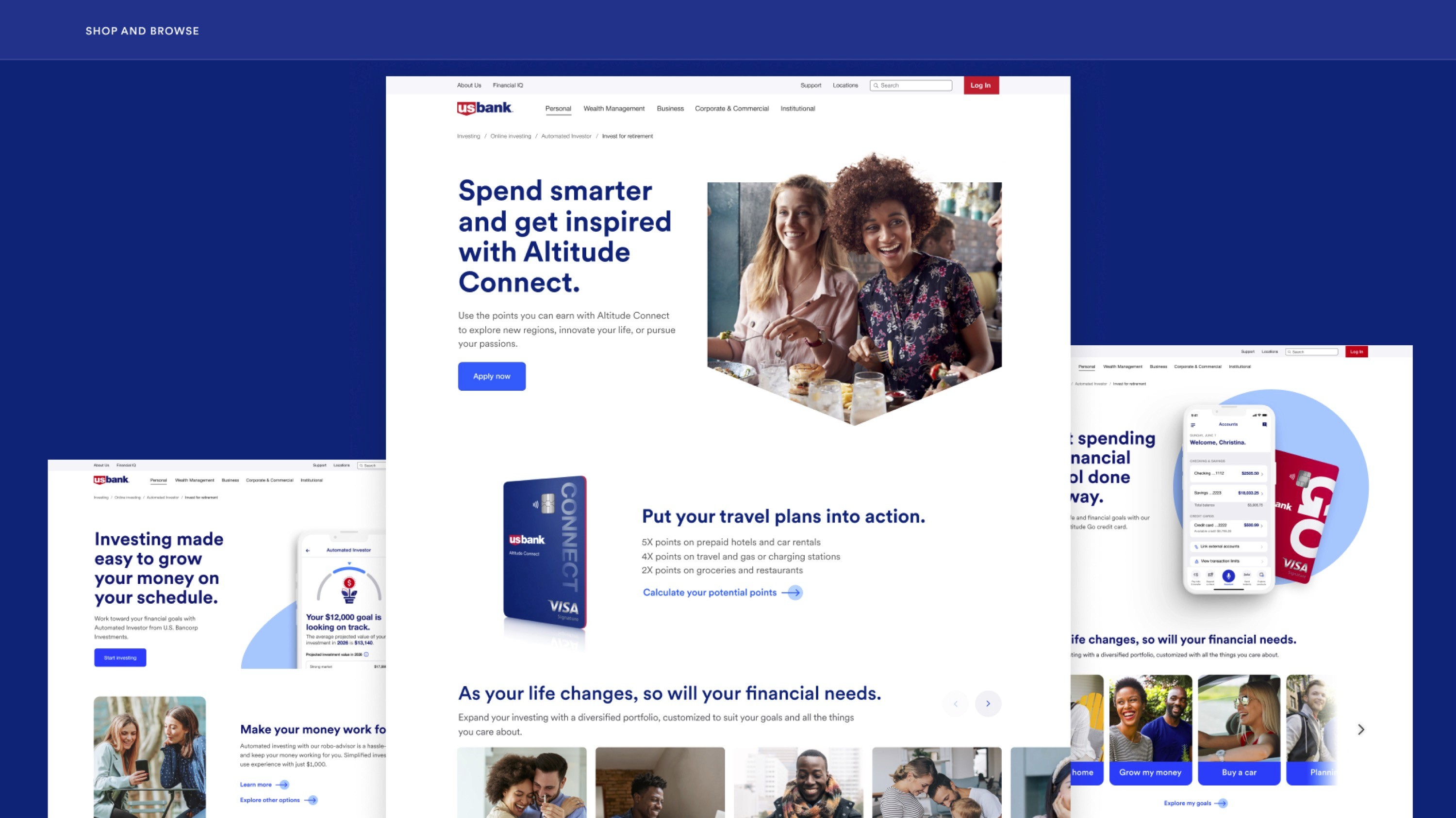
The redesigned experience below shows how the same financial products (credit cards, investment tools, savings vehicles) can feel completely different when the visual and structural logic starts from the user's life rather than the bank's product taxonomy.
Impact
The work across both initiatives delivered measurable results and, more importantly, meaningful ones.
Automated Investor
Secured executive buy-in by championing the design strategy across multiple tiers of leadership, from 800 peers to the 10-person C-suite, aligning business goals with user needs and resolving stakeholder dissent.
35% reduction in onboarding time, improving completion rates across mobile and web.
25% conversion lift through simplified risk profiling and progressive disclosure.
20% increase in user satisfaction reported in post-launch feedback.
Regulatory compliance touchpoints integrated seamlessly, minimizing drop-offs while improving transparency.
Cross-functional efficiency improved by 30%, aligning design, product, and engineering through a shared component system.
Shop & Browse
+30% increase in product exploration and application starts.
+22% brand uplift among the emergent affluent audience.
Expanded design-system adaptability with new, research-backed components.
Elevated perception of U.S. Bank as a modern, human-centered brand.
Reflection
"The redesigned experience proved that financial complexity could be made simple, and that trust and usability are not opposites but complements when designed intentionally."
The work at U.S. Bank reinforced something I believe deeply: in high-stakes, regulated environments, design has the greatest opportunity to do meaningful work. But getting there required more than solid UX. It required relentless advocacy.
The hardest part of this project wasn't the design. It was the 18 months of alignment work that preceded shipping. Financial products carry institutional inertia. Legal teams, compliance officers, product managers, and executives all have legitimate competing interests, and a design that satisfies users but doesn't hold up to that scrutiny doesn't survive. I learned to treat every stakeholder conversation as a design problem in its own right: understand their constraints, find the language that makes user needs legible at a business level, and build enough trust that the right call can actually get made.
There's a version of this project that could have shipped faster by softening the principles: burying the compliance disclosures, making the risk quiz optional, simplifying the investment mix into a single recommendation. Each of those compromises would have been defensible. None of them would have built the foundation of trust that makes people come back.
What I'm most proud of isn't the 35% onboarding improvement. It's that the experience we shipped respects users enough to tell them the truth about risk, give them real control over their goals, and treat complexity as something to navigate together rather than hide. That's harder to measure. And it's the thing that lasts.
When I joined the team, the digital investing experience was fragmented. Users were dropped into complex financial concepts with no guidance, asked to make high-stakes decisions with minimal context, and abandoned at the moments that mattered most: onboarding, risk selection, and product decisions. The data confirmed what qualitative research had already surfaced. Users didn't lack intent. They lacked clarity.
The problem wasn't any single screen. It was the entire system.
Project 1: Automated Investor Journey
Small effort. Big results. Approachable for everyone.
The Automated Investor platform was U.S. Bancorp Investments' robo-advisory product, built to help everyday customers start investing toward personal goals. In theory, a powerful offering. In practice, a maze of an experience that intimidated the very people it was designed to serve.
The problem
The existing onboarding flow asked users to interpret financial jargon, complete disconnected steps, and accept regulatory disclosures without ever understanding why they mattered. Drop-off rates spiked at every friction point. The experience felt like a compliance checklist dressed up as a product.
My approach
I approached this as a systems design challenge, starting from how real people think about money rather than how financial products are legally structured. Through user research, journey mapping, and iterative prototyping, one insight kept surfacing: users needed a guided, conversational experience. Not a series of forms.
The redesign centered on three principles:
Progressive Disclosure. Surface only what users need to make the next decision. Financial complexity should unfold naturally, not hit all at once.
Goal-First Architecture. Begin with what users actually want: a house, retirement, a child's education. Anchor every step to something emotionally meaningful before introducing the mechanics of how to get there.
Compliance as Clarity. Regulatory requirements aren't obstacles to bury or footnote. They're opportunities to build trust. I redesigned every disclosure touchpoint to feel transparent and human, rather than legal and opaque.
The wireframe below shows the full end-to-end system before visual design. Notice how the flow moves from emotional goal-setting into financial mechanics, never the reverse. That sequencing was the core design argument.
The experience
The journey starts with an Insight Card that surfaces relevant financial context inside the user's existing account view, drawing them naturally into the goal-setting flow without a hard redirect. From there, a Goal Page sets the emotional anchor. Goal Setup personalizes the experience: target amount, timeline, flexibility. The Risk Quiz uses plain language and empathetic framing to uncover comfort level without intimidating first-time investors.
The screens below show the first half of the journey, from goal selection through risk assessment. Each step is designed to feel like a decision the user is making for themselves, not a form they're filling out for a bank.
From Risk Results, a Market Simulation makes projected growth tangible and interactive. Users can move a slider to see how different contributions affect their outcome over time. The Investment Mix screen shows exactly how their money will be deployed. The Apply Flow opens an Individual Advisory Account in under ten minutes.
This is the back half of the journey, where abstract risk tolerance becomes a concrete portfolio and intention becomes action.
Every step was built to reduce cognitive load, build confidence, and get out of the way.
Project 2: Shop & Browse
Answering the needs of the emergent affluent crowd.
The second initiative tackled U.S. Bank's product discovery experience: the surface where customers explore credit cards, investment products, and financial tools. The challenge here was different, but equally nuanced.
The Audience
Through UX research and data analysis, we identified a fast-growing segment within U.S. Bank's customer base: the emergent affluent. These are digitally-native professionals with rising income, lifestyle-driven priorities, and expectations shaped by premium consumer apps, not traditional banking.
These users valued personalization, immediacy, and experiences that felt curated for them. U.S. Bank's existing Shop & Browse was a one-size-fits-all catalog. It didn't speak to anyone in particular.
My approach
I led the redesign with the emergent affluent as the north star, while ensuring the experience scaled gracefully across all customer segments.
The work involved deep competitive analysis, audience segmentation, and close collaboration with product strategy and engineering to define what a premium financial shopping experience could look like inside U.S. Bank's design system and regulatory framework.
Key design decisions included:
Lifestyle-aligned visual hierarchy. Product features presented through the lens of aspiration and real-world use, not feature lists.
Contextual product surfacing. Relevant products appear at the right moments, tied to life events and stated goals.
Elevated design language. Photography direction, typography treatment, and component refinements that signal premium without departing from the core brand.
Design system expansion. New research-backed components that extend the U.S. Bank system with adaptability for future campaigns and segments.
The redesigned experience below shows how the same financial products (credit cards, investment tools, savings vehicles) can feel completely different when the visual and structural logic starts from the user's life rather than the bank's product taxonomy.
Impact
The work across both initiatives delivered measurable results and, more importantly, meaningful ones.
Automated Investor
Secured executive buy-in by championing the design strategy across multiple tiers of leadership, from 800 peers to the 10-person C-suite, aligning business goals with user needs and resolving stakeholder dissent.
35% reduction in onboarding time, improving completion rates across mobile and web.
25% conversion lift through simplified risk profiling and progressive disclosure.
20% increase in user satisfaction reported in post-launch feedback.
Regulatory compliance touchpoints integrated seamlessly, minimizing drop-offs while improving transparency.
Cross-functional efficiency improved by 30%, aligning design, product, and engineering through a shared component system.
Shop & Browse
+30% increase in product exploration and application starts.
+22% brand uplift among the emergent affluent audience.
Expanded design-system adaptability with new, research-backed components.
Elevated perception of U.S. Bank as a modern, human-centered brand.
Reflection
"The redesigned experience proved that financial complexity could be made simple, and that trust and usability are not opposites but complements when designed intentionally."
The work at U.S. Bank reinforced something I believe deeply: in high-stakes, regulated environments, design has the greatest opportunity to do meaningful work. But getting there required more than solid UX. It required relentless advocacy.
The hardest part of this project wasn't the design. It was the 18 months of alignment work that preceded shipping. Financial products carry institutional inertia. Legal teams, compliance officers, product managers, and executives all have legitimate competing interests, and a design that satisfies users but doesn't hold up to that scrutiny doesn't survive. I learned to treat every stakeholder conversation as a design problem in its own right: understand their constraints, find the language that makes user needs legible at a business level, and build enough trust that the right call can actually get made.
There's a version of this project that could have shipped faster by softening the principles: burying the compliance disclosures, making the risk quiz optional, simplifying the investment mix into a single recommendation. Each of those compromises would have been defensible. None of them would have built the foundation of trust that makes people come back.
What I'm most proud of isn't the 35% onboarding improvement. It's that the experience we shipped respects users enough to tell them the truth about risk, give them real control over their goals, and treat complexity as something to navigate together rather than hide. That's harder to measure. And it's the thing that lasts.